Coastal Jamfest
Tools used: Adobe Illustrator
Brand designer, Illustrator
Assignment: Choose a topic or technique that excites you—something you’ll genuinely look forward to spending about 15 minutes on each day for 30 days. By the end of the month, there will be a collection of work to showcase or build into a larger project.
Thought Process: This poster series for Coastal Jamfest was a self-initiated project aimed at exploring bold typography, vibrant color palettes, and dynamic compositions within the context of a fictional summer music festival. Inspired by retro-futuristic aesthetics and the energy of NYC’s music scene, I chose to create a cohesive visual identity that extended across multiple promotional pieces. The process involved experimenting with gradients, abstract forms, and type treatments that mimic motion and sound.
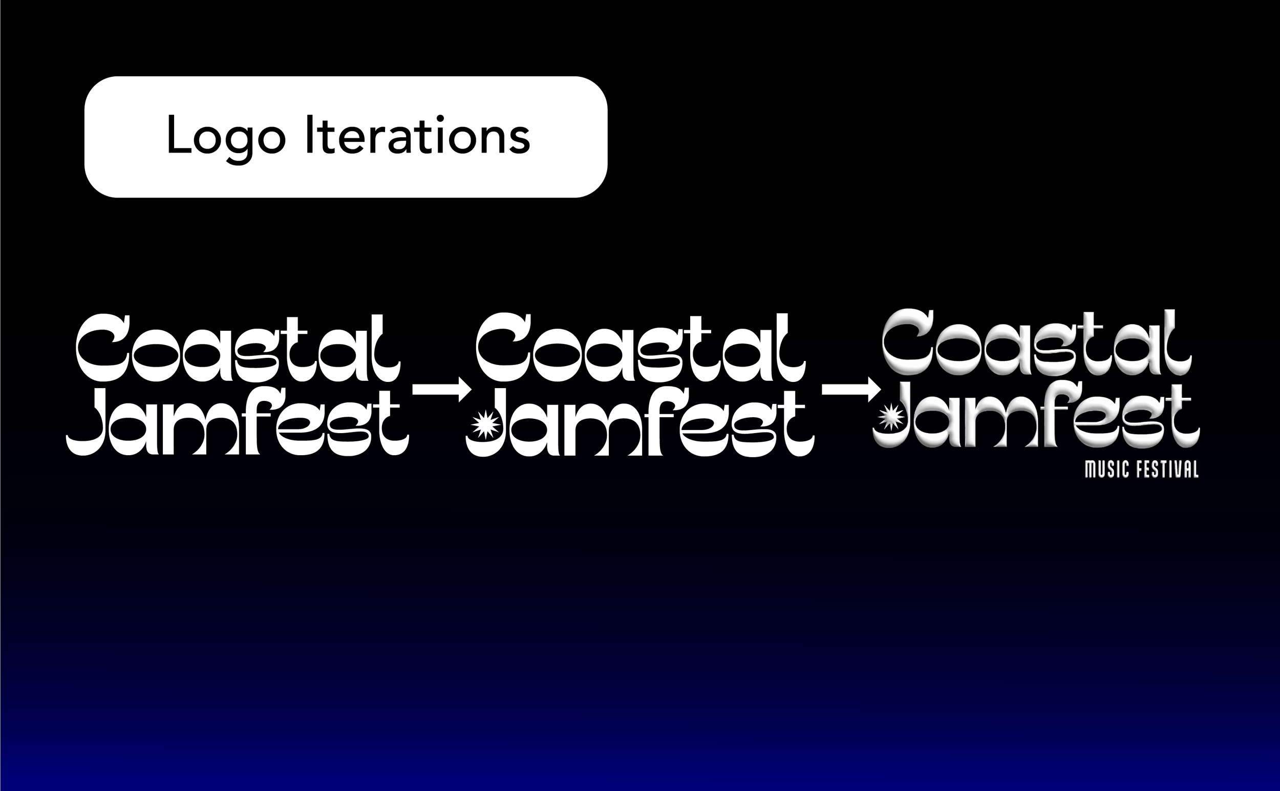
Logo Concept
The Coastal Jamfest logo combines a sleek, futuristic typeface with a playful sun icon cleverly integrated into the letter “J.” This design choice merges modern energy with a subtle nod to summer, creating a unique wordmark that feels both cutting-edge and seasonally rooted. The sun symbol adds warmth and personality, reinforcing the festival’s identity as a vibrant, coastal celebration of music, light, and movement.

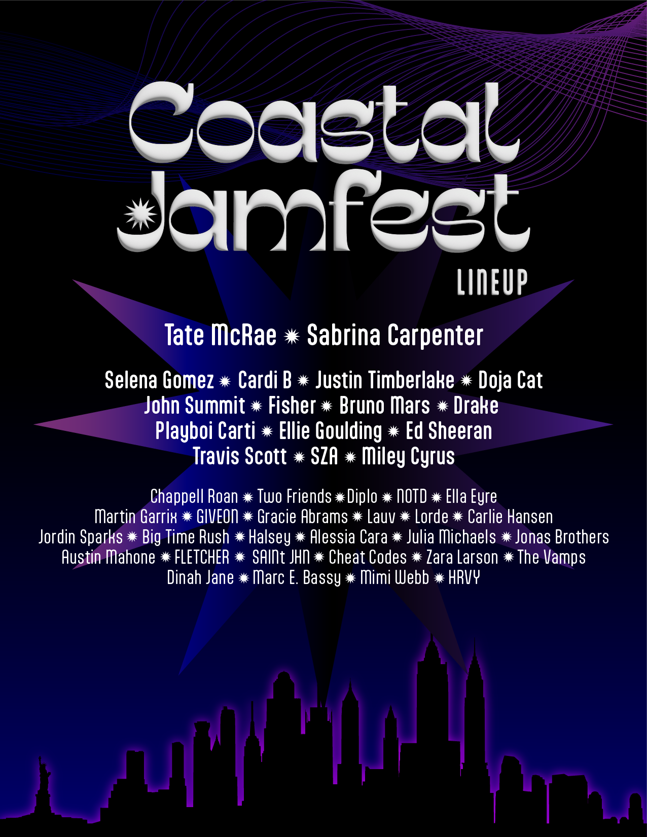
Promotional Posters
The process of creating the Coastal Jamfest promotional posters centered around capturing the electric energy of summer nights through bold neon graphics and vibrant imagery. Starting with moodboards inspired by synthwave, retro-futurism, and modern music visuals, I developed a palette of glowing gradients, abstract waveforms, and dynamic compositions. The posters were designed to feel immersive and rhythmic, using layered shapes, textures, and lighting effects to evoke motion, sound, and coastal vibes.


Other Promotional Material
To expand the Coastal Jamfest identity beyond posters, I created a series of supporting promotional materials that maintained the same vibrant, neon-infused aesthetic. A looping GIF of the logo was developed with subtle wave-like motion and a glowing effect to bring the brand to life on digital platforms. Billboard mockups were designed with bold, high-contrast layouts and oversized typography to grab attention in busy urban settings. Custom ticket designs incorporated images from the posters to make the physical experience feel special and collectible.


Process
-
![]()
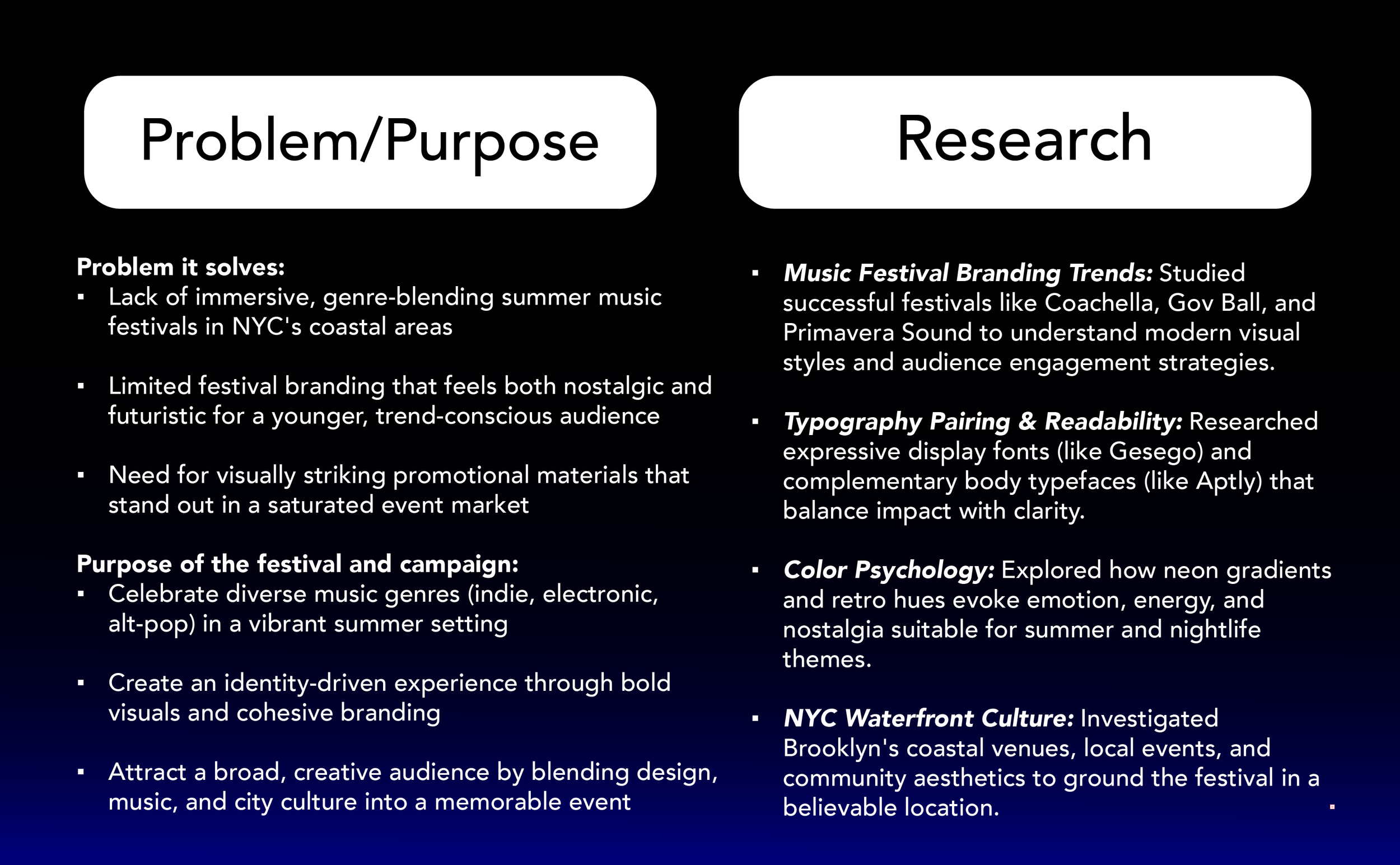
Problem and Research
-
![]()
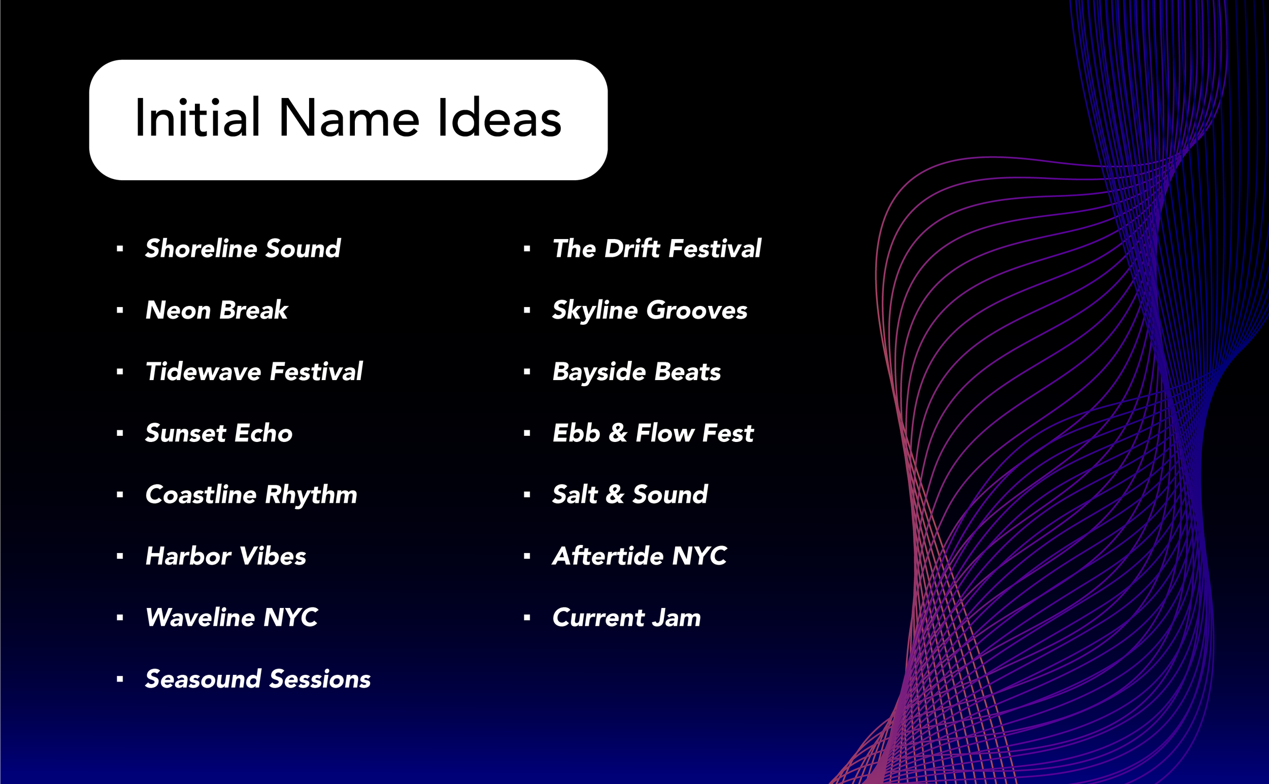
Naming
-
![]()
Logo Iterations
-
![]()
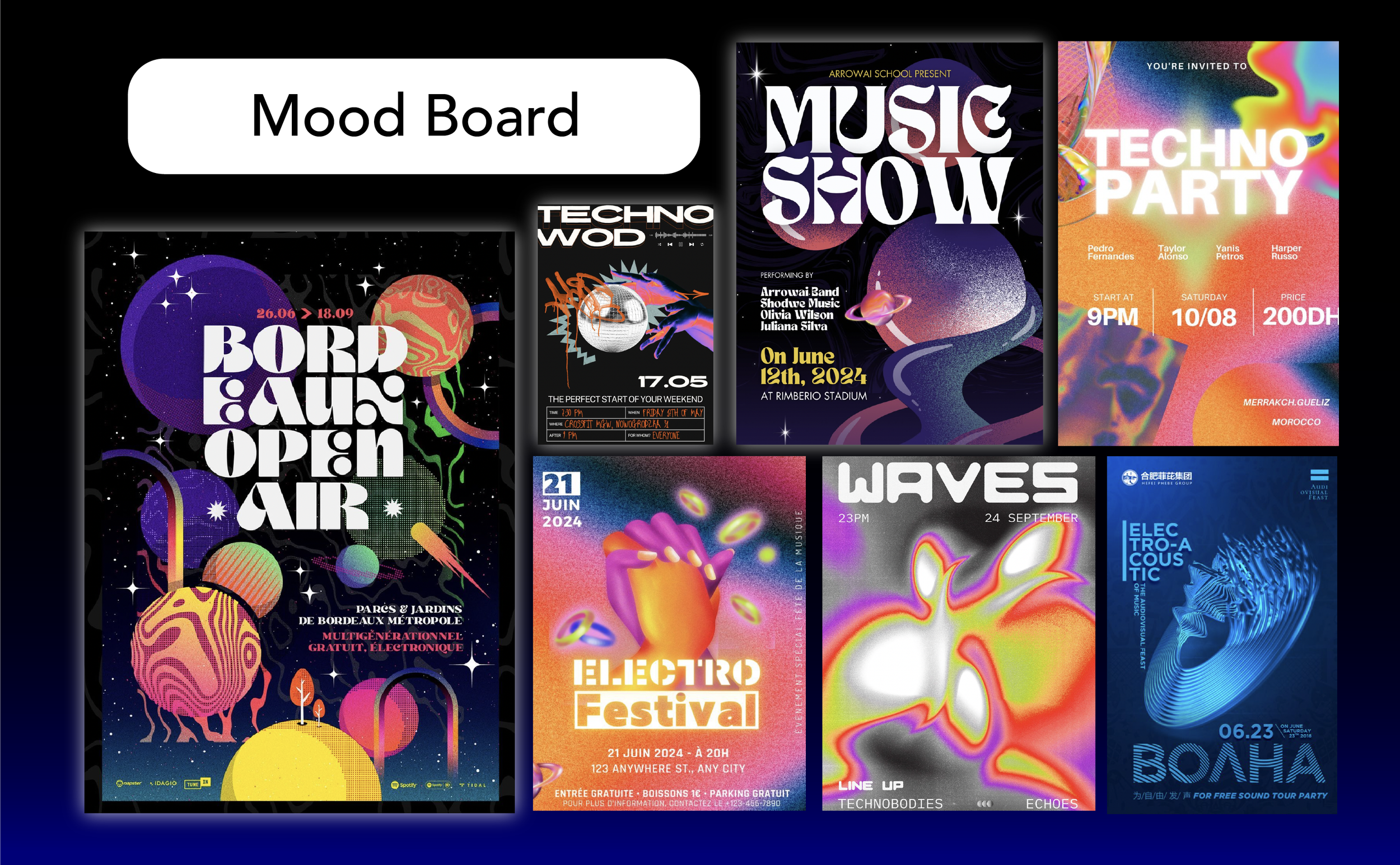
Mood Board